5 Quality control and filtering
5.1 Goals
- Explore common quality control (QC) metrics used in spatial transcriptomics,
such as total transcript counts, detected genes, cell area, and negative probe
percentages
- Understand potential sources of technical artefacts (e.g. segmentation errors, low RNA capture, or border effects)
- Use negative control probes to quantify background noise in im-SRT data
- Select and justify appropriate sample-specific filtering thresholds for QC metrics
5.2 Overview
Quality control is a key step at the beginning of any bioinformatics processing pipeline. Understanding the potential sources of bias introduced during the data generation steps is key in helping interpret the results of downstream data processing steps.
knitr::opts_chunk$set(
  echo = TRUE,
  warning = FALSE
)

# load libraries for this step
library(Seurat)
library(tidyverse)
library(here)
Read in subsampled seurat object.
5.3 Identifying potential technical artefacts
Library size (total transcripts) and cell areas are good indicators of technical artefacts introduced during data generation steps.
Possible artefacts can include:
- Low quality cells
- Cell segmentation challenges (combining two cells, not aligned with real cell boundaries, leading to high cell area and low RNA count)
Understanding how these are prevalent in your data can help with biological interpretation downstream. For example, discerning whether differences in cells are due to e.g. cell type differences, or technical artefacts.
We will first view the library size and cell area distributions on their own.
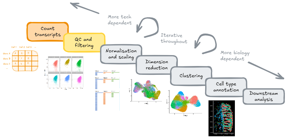
5.3.1 Library size (transcript counts)
ggplot(so@meta.data, aes(x = nCount_RNA, col = tissue_sample)) +
  geom_density() +
  scale_x_log10() +
  theme_bw() +
  annotation_logticks(sides = "b", colour = "lightgrey") +
  ggtitle("Transcript counts per cell")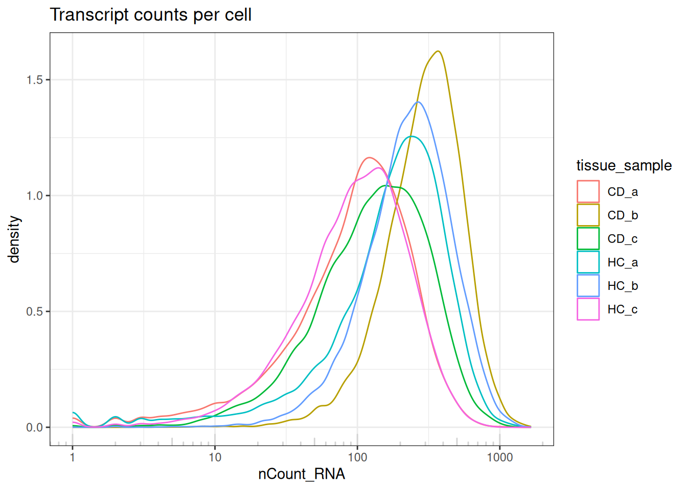
The transcripts per cell all display a log-normal distribution with shifting medians.
Indicates no largely low-quality cells, and a good example of library size effects that should be normalised downstream, prior to analyses.
5.3.2 Cell surface area
# Total counts per cell
ggplot(so@meta.data, aes(x=Area, col=tissue_sample)) +
  geom_density() +
  scale_x_log10() +
  theme_bw() +
  annotation_logticks(sides = "b") +
  ggtitle("Area (px^2) per cell")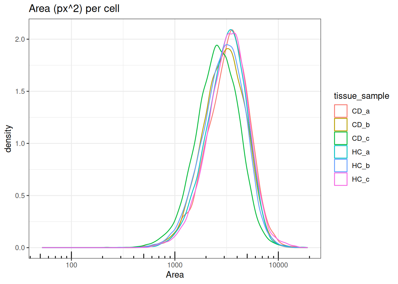
Areas also follow log-normal distributions with medians ranging between 3,000 -
4,000px^2. Sample/FOV CD.c has slightly smaller cell area with a median
of ~2,000px^2.
5.4 Bivariate QC
The next plot compares total transcript counts (nCount_RNA) with the number of detected genes (nFeature_RNA) for each sample. The strong positive relationship indicates that most captured transcripts are successfully mapped to known genes, reflecting good data quality and sound probe hybridisation.
Only a small subset of cells deviates from this trend - typically those with low total counts. This suggests low-quality cells in the tissue sample, rather than widespread technical artefacts.
so@meta.data %>%
  ggplot(aes(x = nCount_RNA, y = nFeature_RNA, colour = tissue_sample)) +
  geom_point(alpha = 0.4, size = 0.1) +
  facet_wrap(~tissue_sample) +
  theme_light() +
  theme(legend.position = "none")
Accounting for variation in cell sizes
Cautious of samples with highly variable varying sizes. Total transcript counts and cell areas can vary substantially. Applying “standard” QC or filtering thresholds uniformly across all cells may remove valid cells.
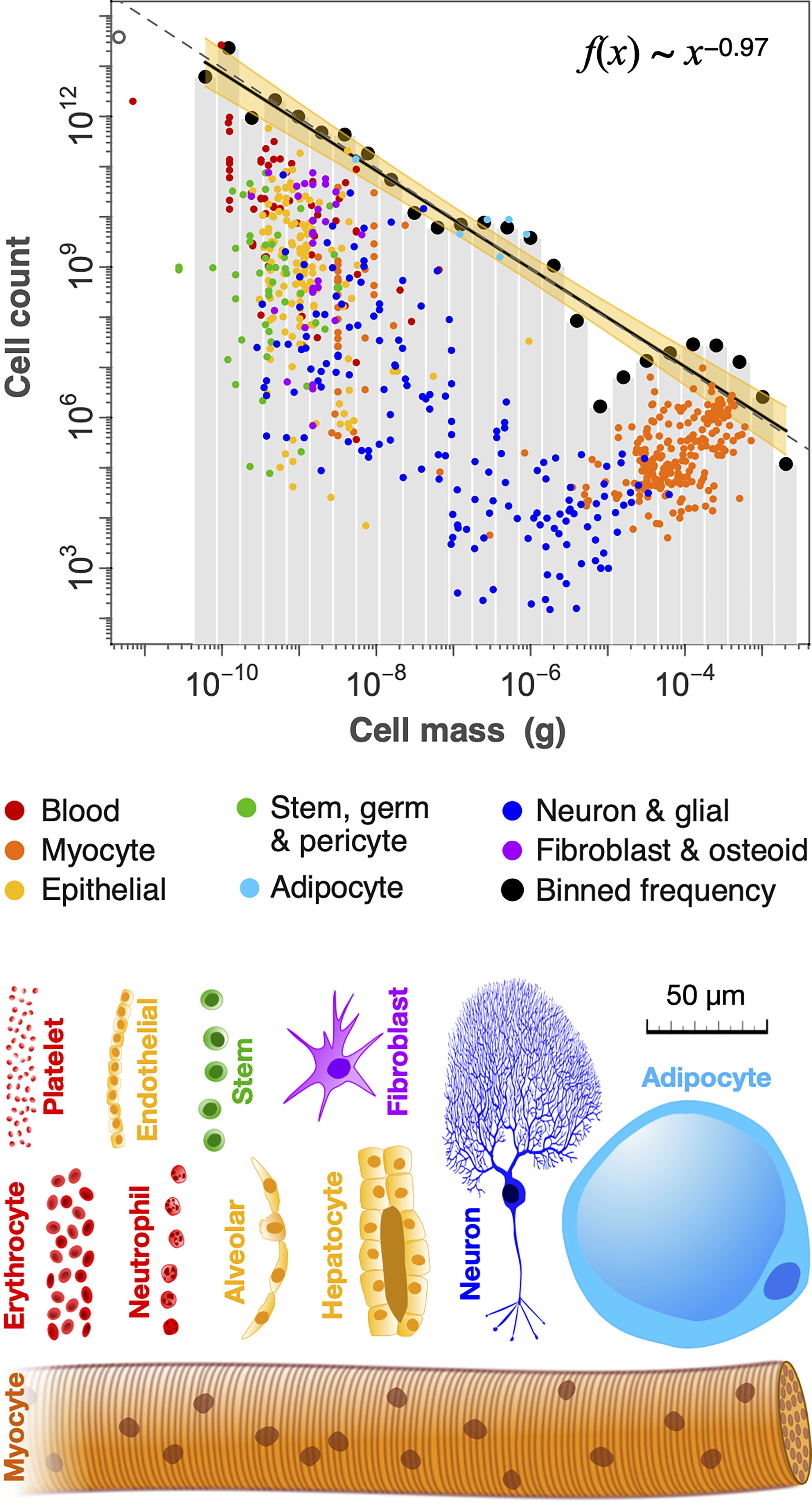
Fig 3. from Hatton et al. (2023): Distribution of cell mass (g) across different cell types.
The following plot shows the relationship between the total transcript counts (nCount_RNA) and cell area across samples. In all tissue samples (Seurat FOVs), larger cells generally contain more transcripts, forming a positive log-log correlation.
However, some samples (HC.a, HC.c, CD.a, CD.c) display greater
variability and a subset of small, high-transcript cells, which may indicate
segmentation artefacts or biological differences such as the presence of smaller immune cells.
ggplot(so@meta.data, aes(x=Area, y=nCount_RNA, colour=tissue_sample)) +
  geom_point(size = 0.1, alpha = 0.4) +
  scale_x_log10() +
  scale_y_log10() +
  annotation_logticks(sides = "bl") +
  facet_wrap(~tissue_sample) +
  annotation_logticks(colour = "lightgrey") +
  theme_light()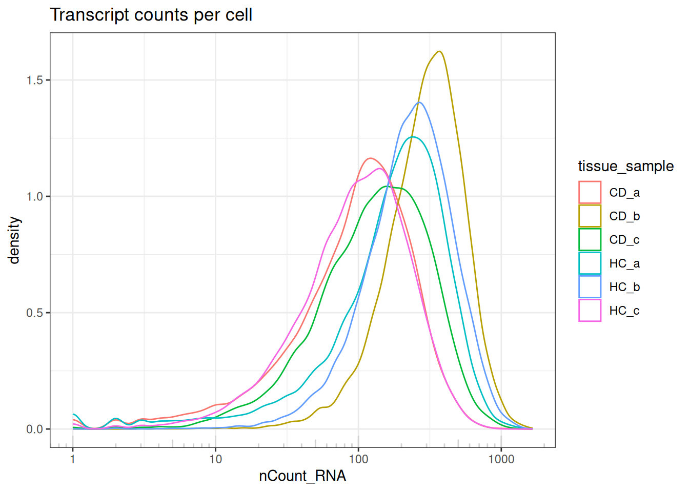
5.5 Filtering low-quality cells
5.5.1 Negative probes as an indicator of noise
Spatial transcriptomics assays include both RNA-specific probes, and negative control probes (or, background probes). While RNA specific-probes hybridise to specific targets, negative probes do not bind to anything. Their primary purpose is to quantify and account for this technical noise and non-specific signal.
In this step, we will calculate the proportion of negative control probes relative to the total counts (RNA) for each cell. Cells exhibiting a high percentage of noise (i.e., high proportion of negative probe counts) can be flagged and removed during the QC stage.
Key metrics to add to the Seurat object:
-
so$percent_neg: The percentage of negative probes per cell -
so$mean_neg: The average negative probes per cell
so$percent_neg <- (so$nCount_negprobes / (so$nCount_RNA + so$nCount_negprobes)) * 100

# Join layers to calculate average_neg
so@assays$negprobes <- JoinLayers(so@assays$negprobes)
so$mean_neg <- colMeans(so@assays$negprobes) # Only defined first sample
The bar plot shows that some samples (CD_b, CD_c, and HC_b) have higher average negative probe counts, suggesting variable levels of noise across slides.
so@meta.data %>%
  ggplot(aes(x = tissue_sample, y = mean_neg, colour = tissue_sample)) +
  geom_col() +
  theme_light()
However, displaying summary metrics alone, such as the average may not capture the variation in the data, or may be skewed. The density plot illustrates that most cells across all samples have low levels of background signal, as indicated by the small proportion of negative probes (medians across all samples < 2%). While overall data quality appears high, minor shifts suggest minimal between-sample variation.
so@meta.data %>%
  ggplot(aes(x = percent_neg, colour = tissue_sample)) +
  geom_density() +
  scale_x_log10() +
  theme_light() +
  annotation_logticks(sides = "b", colour = "lightgrey")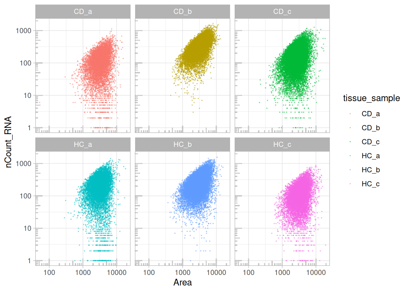
# Discuss difference with Xenium - xenium lower counts, lower background.
ggplot(so@meta.data, aes(y=mean_neg, x=nCount_RNA)) +
  geom_point(pch=3, alpha=0.1) +
  scale_x_log10() +
  theme_bw() +
  ggtitle("Negative probes vs counts")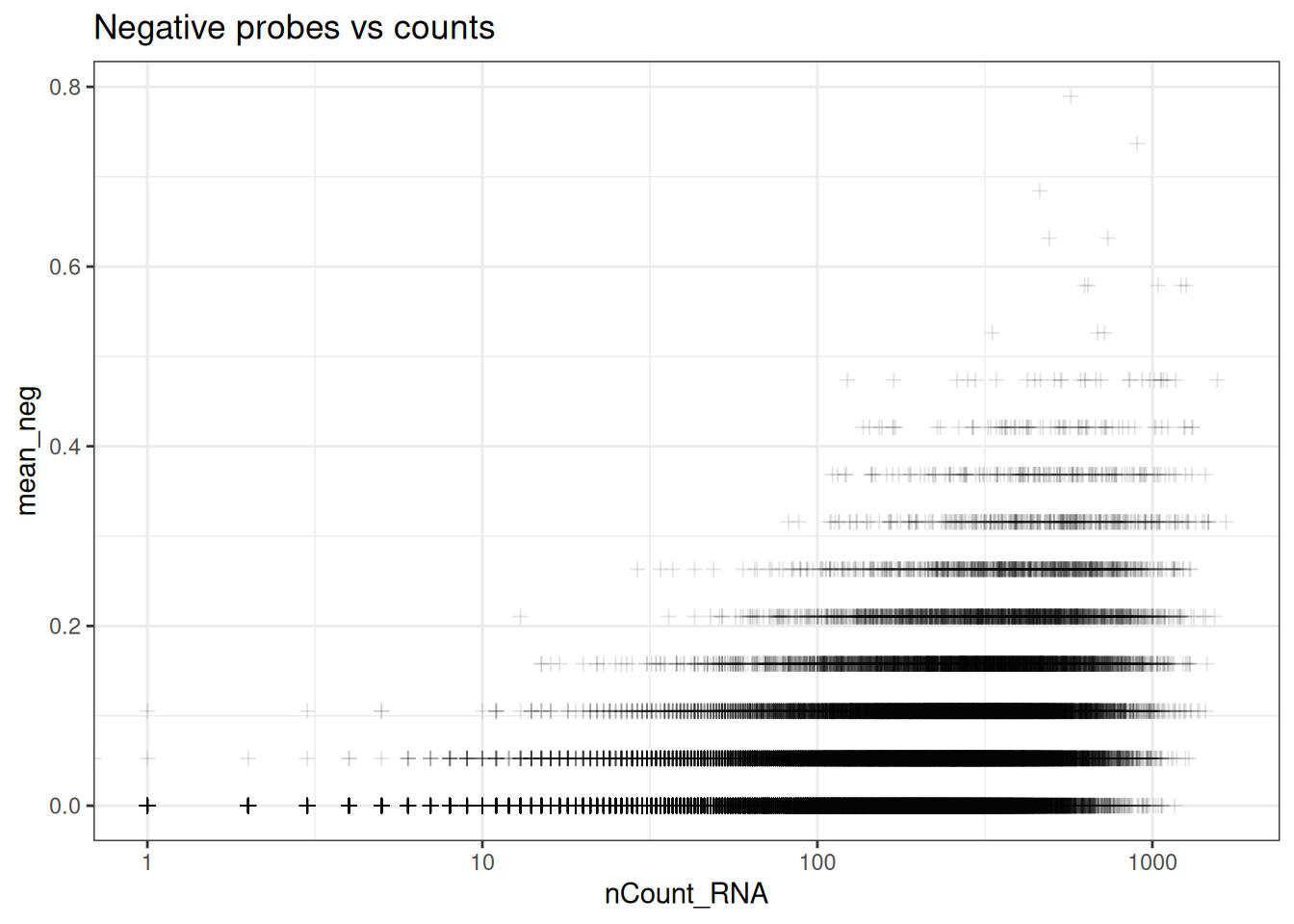
ggplot(so@meta.data, aes(y=percent_neg, x=nCount_RNA)) +
  geom_point(pch=3, alpha=0.1) +
  scale_x_log10() +
  coord_cartesian(ylim = c(0, 10)) +
  facet_wrap(~tissue_sample) +
  theme_bw() +
  ggtitle("Negative probes vs counts")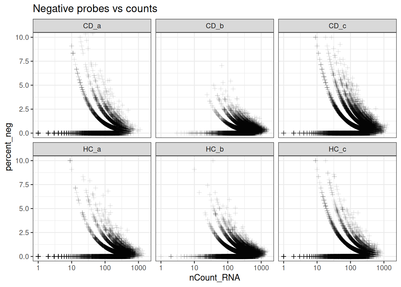
min_ncount_rna <- 90
max_percent_neg <- 2
ggplot(so@meta.data, aes(y=percent_neg, x=nCount_RNA)) +
  geom_point(pch=3, alpha=0.1) +
  geom_hline(yintercept = max_percent_neg, lty=3, colour = "red") +
  geom_vline(xintercept = min_ncount_rna, lty=3, colour = "red") +
  scale_x_log10() +
  coord_cartesian(ylim = c(0, 21)) +
  facet_wrap(~tissue_sample) +
  theme_bw() +
  ggtitle("Negative probes vs counts")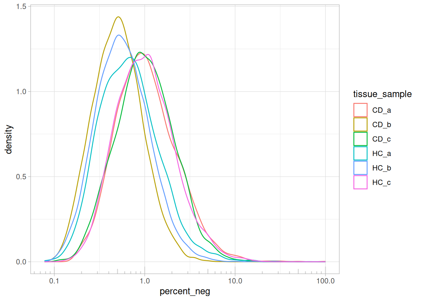
5.5.2 Identifying filtering thresholds
# Apply a filter
so@meta.data <-
  so@meta.data %>%
  mutate(
    qc = if_else(nCount_RNA >= min_ncount_rna & percent_neg <= max_percent_neg, "Keep", "Remove")
  )

table(so$qc, so$orig.ident)
##
## GSM7473682.HC.a GSM7473683.HC.b GSM7473684.HC.c GSM7473688.CD.a
## Keep 6811 14002 5326 4216
## Remove 1984 1764 4393 3323
##
## GSM7473689.CD.b GSM7473690.CD.c
## Keep 12479 8636
## Remove 720 4970Nearly 50% of the cells for HC.c will be filtered out, display which cells will be removed.
ImageDimPlot(so, fov = "GSM7473684.HC.c", group.by = "qc")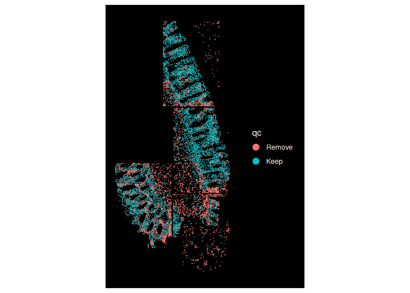
The stromal compartment will be removed entirely and can be difficult for co-localisation analyses. Further, the epithelial compartment in the bottom left FOV is very patchy.
5.6 ACTIVITY: Identifying your own filtering thresholds
You have seen an example where stringent filtering omits key cells or compartments.
Identify a suitable threshold for min_ncount_rna and max_percent_neg by
iteratively:
- Changing the thresholds for
min_ncount_rnaandmax_percent_neg - Displaying the bivariate distribution of
nCount_RNAandpercent_negper tissue sample - Using
ImageDimPlotto visualise which cells are removed
Code blocks are provided for the above steps.
# Default thresholds that will keep all cells
min_ncount_rna <- 0
max_percent_neg <- Inf
ggplot(so@meta.data, aes(y=percent_neg, x=nCount_RNA)) +
  geom_point(pch=3, alpha=0.1) +
  geom_hline(yintercept = max_percent_neg, lty=3, colour = "red") +
  geom_vline(xintercept = min_ncount_rna, lty=3, colour = "red") +
  scale_x_log10() +
  coord_cartesian(ylim = c(0, 21)) +
  facet_wrap(~tissue_sample) +
  theme_bw() +
  ggtitle("Negative probes vs counts")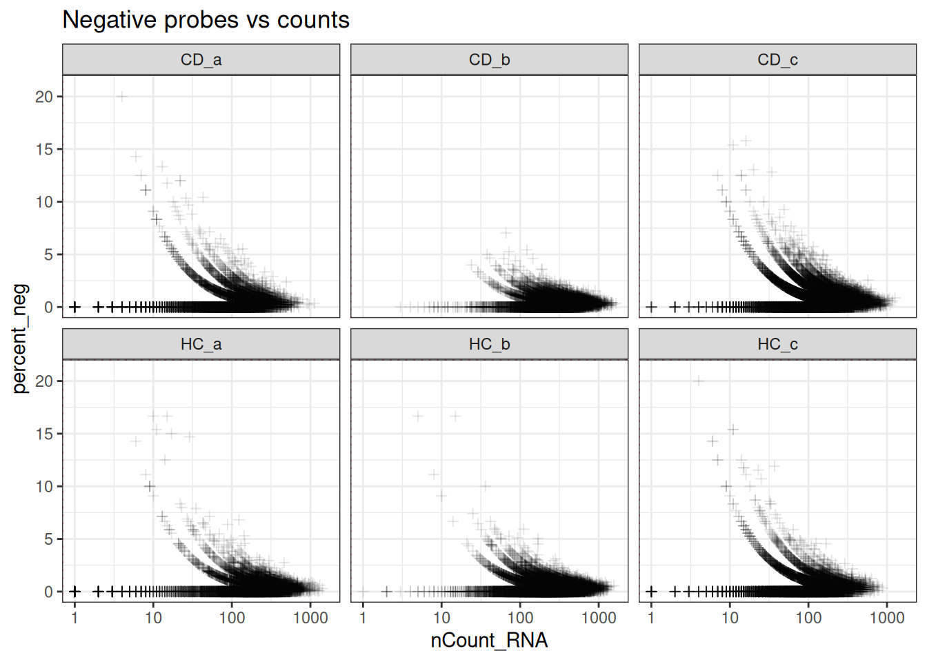
so@meta.data <-
  so@meta.data %>%
  mutate(
    qc = if_else(nCount_RNA >= min_ncount_rna & percent_neg <= max_percent_neg, "Keep", "Remove")
  )

table(so$qc, so$orig.ident)
##
## GSM7473682.HC.a GSM7473683.HC.b GSM7473684.HC.c GSM7473688.CD.a
## Keep 8795 15766 9719 7539
##
## GSM7473689.CD.b GSM7473690.CD.c
## Keep 13199 13606
# Epithelial compartment less patchy, but still hard to retain the stromal cells
# These are the trade-offs to consider
ImageDimPlot(so, fov = "GSM7473684.HC.c", group.by = "qc")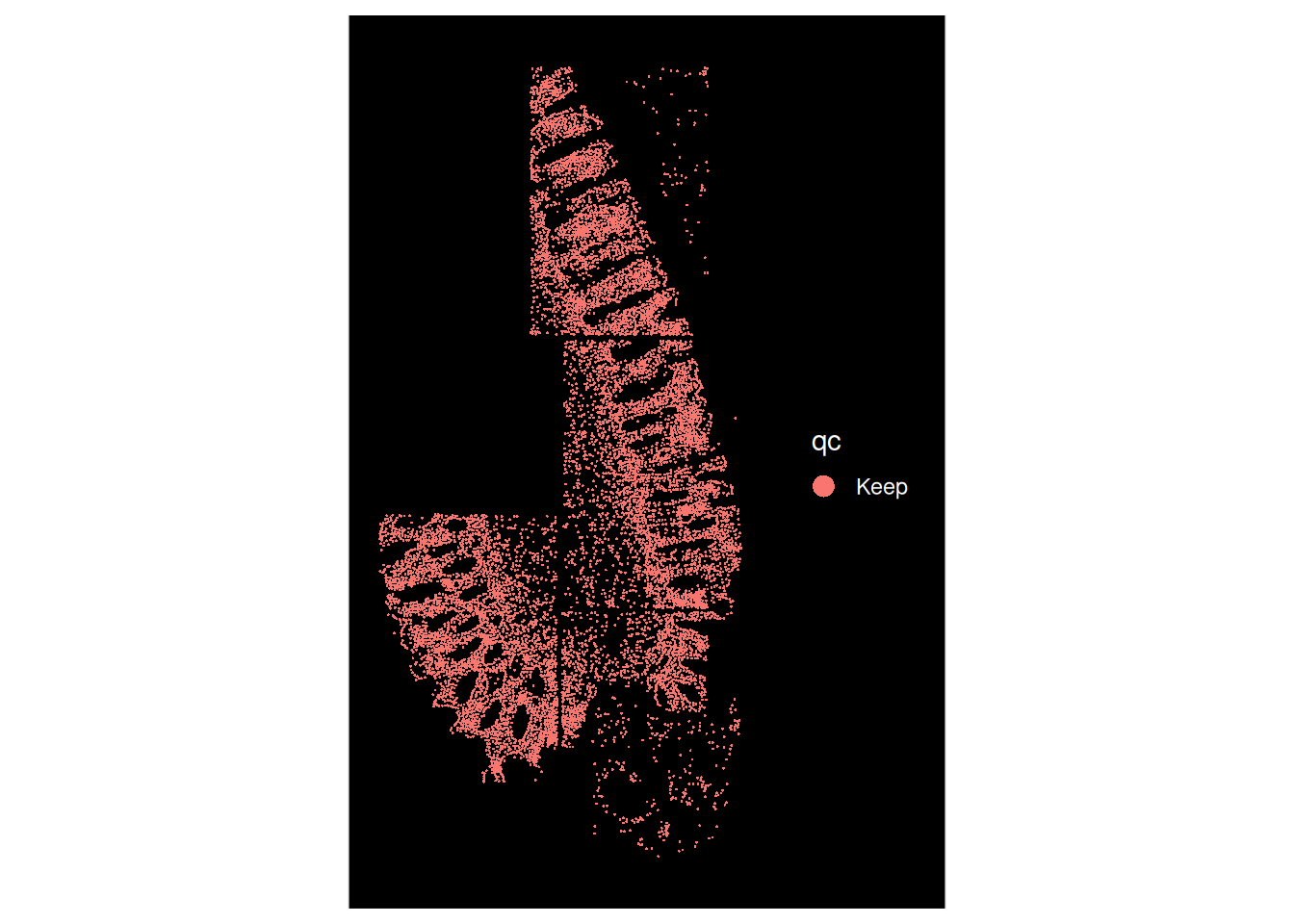
# A lot of cells marked for removal and a bit patchy
ImageDimPlot(so, fov = "GSM7473688.CD.a", group.by = "qc")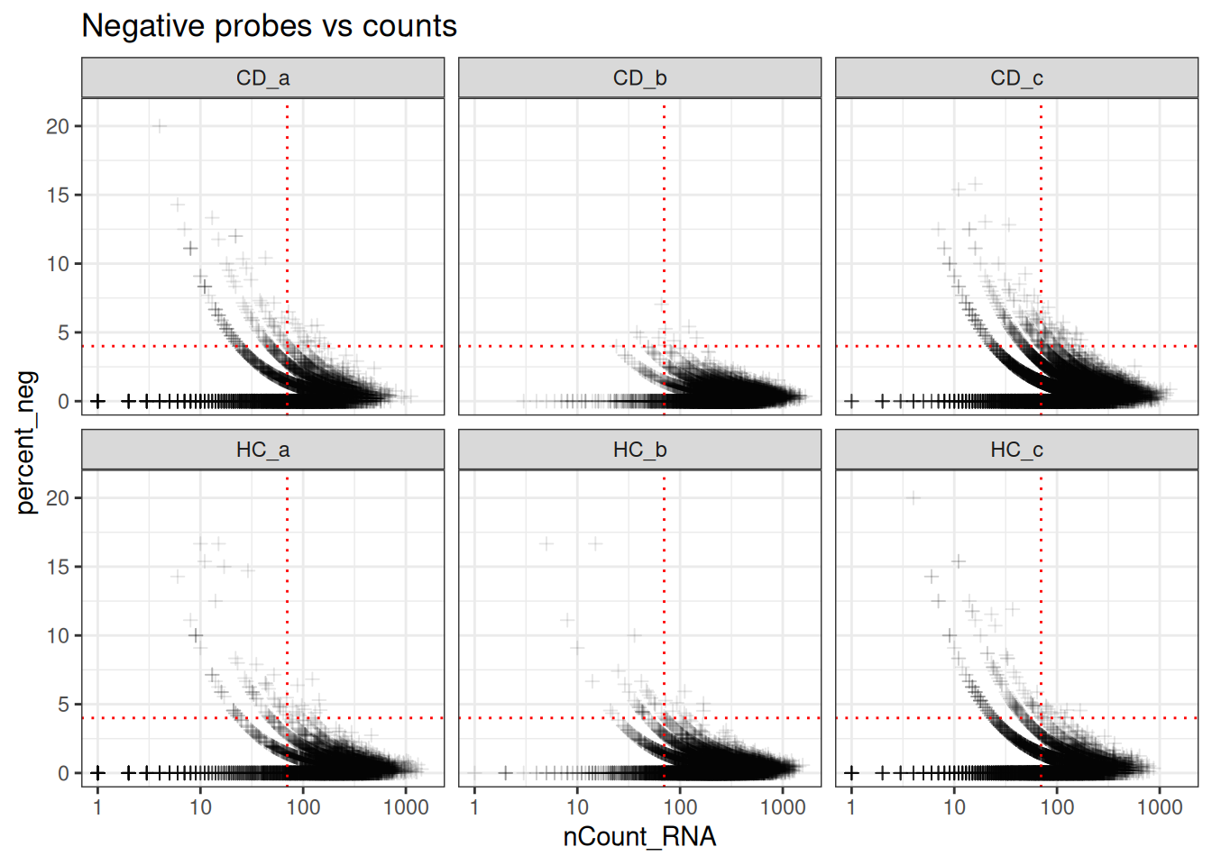
5.6.1 Applying the filter
For the purposes of the workshop, we will all use the same threshold.
min_ncount_rna <- 70
max_percent_neg <- 4##
## GSM7473682.HC.a GSM7473683.HC.b GSM7473684.HC.c GSM7473688.CD.a GSM7473689.CD.b
## 8795 15766 9719 7539 13199
## GSM7473690.CD.c
## 136065.7 Field of View QC (CosMX only; Advanced)
Good to check library sizes across FOVs - red flags include FOVs with close to no cells.
so@meta.data %>%
  unite(col = unique_fov_names, orig.ident, fov, remove = F) %>%
  ggplot(aes(x = nCount_RNA, col = orig.ident, group = unique_fov_names)) +
  geom_density() +
  scale_x_log10() +
  theme_light() +
  annotation_logticks(sides = "b")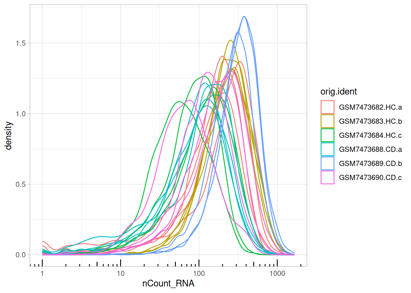
Additionally, when FOVs are “stitched” together a decline in total RNA counts may be observed. For more information, see the recommendations and examples on border effects from OSTA.
5.8 Summary
Quality control (QC) in spatial transcriptomics is a highly iterative and context-dependent process. It requires continual exploration of your data rather than following a prescriptive set of rules. When examining and filtering your data for the first time, we recommend setting permissive threshold so meaningful cells are not removed. After a preliminary look at the data, QC steps can be revisited.
In comparison to older transcriptomics technologies, spatial technologies introduce new sources of technical variation that can make interpretation of your results tricky, and even obscure true, biological signals in the data. While you do not need to filter in every step, it is useful to understand these potential sources of bias, and inform subsequent rounds of QC.
Sources of technical variation are also platform dependent and should be accounted for. For example, CosMx contains FOVs which adds another dimension, compared to Xenium.
Quality control is not a step you conduct once during a pre-processing pipeline. Throughout the following steps in the workshop, you will continue to conduct QC steps.