8 Batch Correction
Goals
- Identify if there are any batch effects in our data, and remove them
- Build a new UMAP plot that has cells grouped more by celltype and less by sample/batch.
8.1 Overview
We generally want to compare and analyse matched cell types (or cell states) across different experimental groups. But transcriptional differences between individuals or batch effects from preparation or slide can introduce other unwanted variation that makes it hard to see cell type differences. We can address this will batch correction or integration methods.
Here is a good description of integration methods and how to choose them, Single cell best practicies, integration, and a review on batch correction methods in single cell data is here Antonsson and Melsted (2025).
8.2 Do we need batch correction?
There are regions in the UMAP where we can see some separation by sample. This is common in spatial data, especially when working with human data.
This example isn’t too bad, but for the purposes of this work, we will go through the process of batch correction.
Of course - if separation aligns with biological groups of interest, correction may not be appropriate; e.g. a knockout can mean a particular celltype never forms, and there is a region with only wild-type samples. Consider what’s going on in your experiment!
Additionally, batch effects can occur at different variables. This experiment has one sample per slide, and the batch effect is seen at that level. If we had multiple samples per slide, we would need to identify if the batch effect is at the slide or sample (or other) level, then split the data at that level with the split() function. Here our data is already split by sample/slide - so we can continue on.
p.uncorrected <- DimPlot(so, group.by='tissue_sample')
p.uncorrected
This becomes more obvious if we split the plot by sample as well;
DimPlot(so, group.by='tissue_sample', split.by = 'tissue_sample', ncol = 3)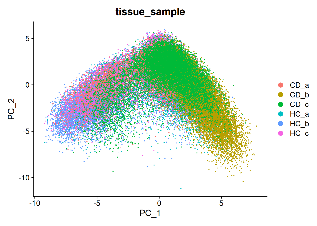
If were were to continue on to cell clustering at analysis at this point, we might find that we build clusters around individual samples.
8.3 Running batch correction
We can apply a batch correction or integration method to adjust our principal components to de-emphasise the between-sample effect. Seurat implements several such methods, and has a full ‘Introduction to scRNA-seq integration’ vignette. We will use the ‘harmony’ method, from Korsunsky et al 2019.
Its worth noting that these same methods can be applied to combine data from multiple experiments (e.g. public data), or even technologies!
This can be one of the most computationally intensive steps of the analysis. It can take hours to run and use many Gb of RAM, scaling with the size of your experiment. On this small subset, it will take a minute or two.
# Run harmony
so <- IntegrateLayers(so, method = HarmonyIntegration, orig.reduction = "pca", new.reduction = "harmony")
# Make a new UMAP, using the harmony values.
so <- RunUMAP(so, dims=1:num_dims, reduction = 'harmony')
DimPlot(so, group.by='tissue_sample')
Looking in the summary of the seurat object we see 3x dimensional reductions:
- pca : Our original principal components, with no batch correction.
- harmony : The harmony output, values like the PCA, but adjusted for batch correction.
- umap : Our new umap which was based on harmony. This overwrote the old UMAP.
Other downstream analyses may use batch corrected data also e.g. clustering. As a rule of thumb, methods that use PCA ( as a multi-gene-summary ) would use the adjusted harmony scores instead, e.g clustering. The counts and normalised assays remain unchanged - so methods that use those directly (e.g. differential expression, plotting) will need to handle batch correction in their own way (e.g. modelling batch).
so## An object of class Seurat
## 999 features across 56853 samples within 2 assays
## Active assay: RNA (980 features, 200 variable features)
## 13 layers present: counts.GSM7473682.HC.a, counts.GSM7473683.HC.b, counts.GSM7473684.HC.c, counts.GSM7473688.CD.a, counts.GSM7473689.CD.b, counts.GSM7473690.CD.c, data.GSM7473682.HC.a, data.GSM7473683.HC.b, data.GSM7473684.HC.c, data.GSM7473688.CD.a, data.GSM7473689.CD.b, data.GSM7473690.CD.c, scale.data
## 1 other assay present: negprobes
## 3 dimensional reductions calculated: pca, umap, harmony
## 6 spatial fields of view present: GSM7473682.HC.a GSM7473683.HC.b GSM7473684.HC.c GSM7473688.CD.a GSM7473689.CD.b GSM7473690.CD.cWhen plotting the new UMAP, the samples are move overlayed. Its a better visualisation, and means our clusters will not be biased to samples.
p.corrected <- DimPlot(so, group.by='tissue_sample')
p.uncorrected + p.corrected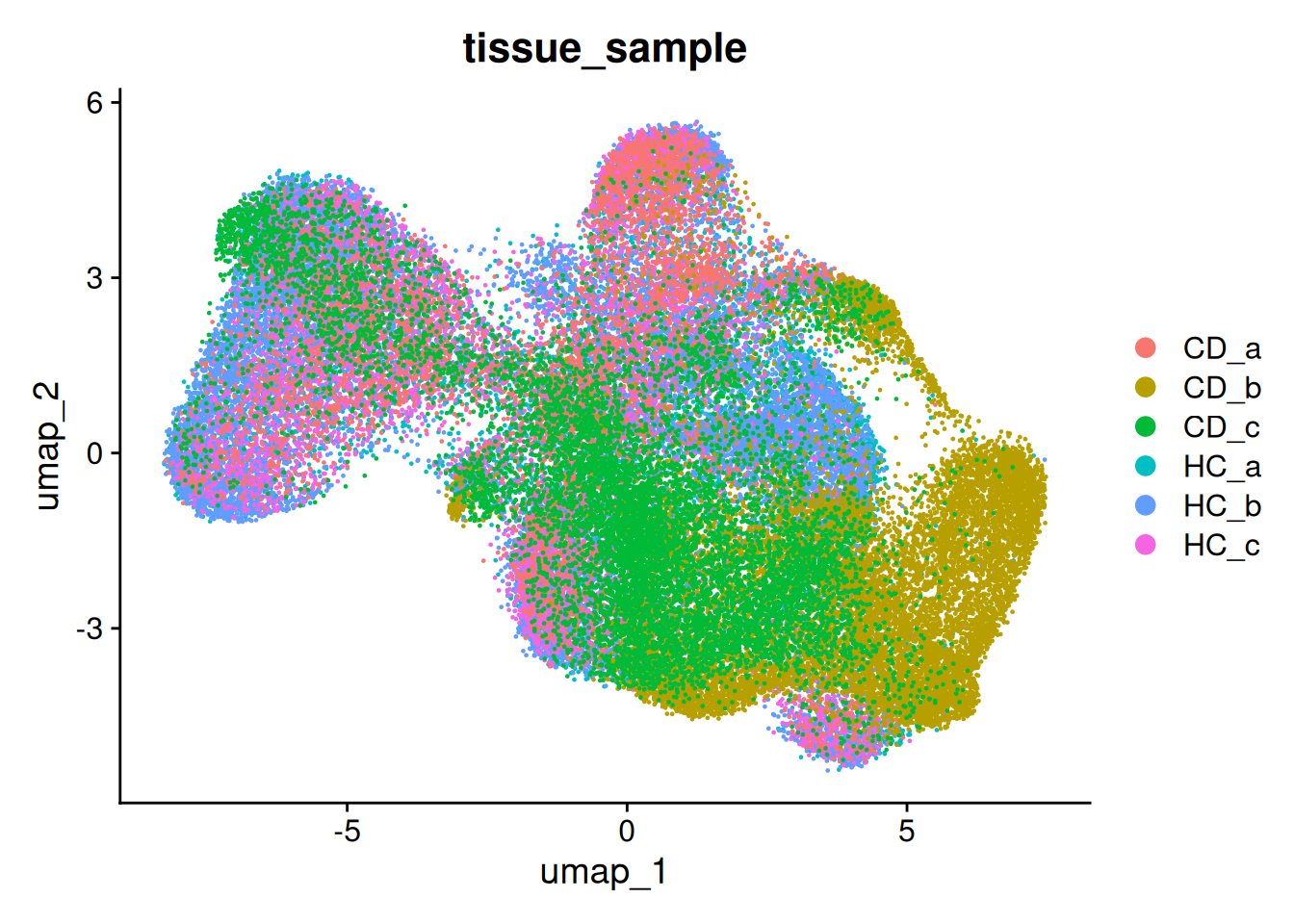
Though, there is still a per-sample difference.
DimPlot(so, group.by='tissue_sample', split.by = 'tissue_sample', ncol = 3)