- Thu 29 October 2020
- R
- Jazmin Ozsvar
- #r, #heatmap, #annotation, #bioinformatics
Annotated heatmaps in R with ComplexHeatmap
A plethora of custom heatmap packages exist for R, but the one capable of building some of the most complex, publication-ready heatmaps is called ComplexHeatmap. The power of this package lies in its ability to annotate the basic heatmap with categorical/continuous scales, or even plots (boxplots, barplots, distributions etc) to get a better sense of the data. ComplexHeatmap was initially designed with bioinformatics analyses such as gene expression in mind, but it can be used for just about anything.
1. Installation
ComplexHeatmap is available on Bioconductor:
if (!requireNamespace("BiocManager", quietly=TRUE))
    install.packages("BiocManager")
BiocManager::install("ComplexHeatmap")
Or you can install it from GitHub:
library(devtools)
install_github("jokergoo/ComplexHeatmap")
2. Data wrangling
ComplexHeatmap accepts matrices in its main argument so make sure you've converted your data to numeric matrix form. We will look at crime statistics in U.S. cities from 1970 using data from the cluster.datasets package (which, by the way, contains lots of data suitable for heatmaps that are well formatted to the point where they are almost plug-and-play). The code for wrangling this data set is simple:
library(cluster.datasets)

data(sample.us.city.crime.1970)
data <- as.matrix(sample.us.city.crime.1970)
rownames(data) <- sample.us.city.crime.1970[,1]
data <- data[,-c(1)]
class(data) <- c("numeric")
ComplexHeatmap does not accept data tidy format! Make sure you have all your columns and rows in matrix format where a single value is at the intersection between a row and a column value. Note that rows and columns need to be labelled accordingly as these names will be displayed as your heatmap labels.
3. The basic heatmap
It's pretty easy to create a simple heatmap with your data matrix - just feed it to Heatmap() to glimpse your data. Let's also define the colours and names in this first step.
# Set heatmap colours
heatmap_colours <- usyd_palette("ochre", 10, type = c("continuous"))

# Create the heatmap
Heatmap(data,
        name = "No. crimes",
        column_title = "Types of crime",
        row_title = "American cities",
        col = heatmap_colours
        )
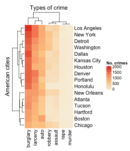
You'll notice that dendrograms and clustering are automatically turned on. The default clustering setting is based on Euclidean distance. You can turn this off by specifying cluster_rows = FALSE and cluster_columns = FALSE.
4. Clustering
We usually want to cluster our heatmap to examine patterns of similarity/dissimilarity within the data. Heatmap accepts built-in clustering arguments based on other packages as well as custom arguments. Some examples of these are:
# Relies on dist()
clustering_method_rows = "pearson"

# Custom argument
clustering_distance_rows = function(x, y) 1 - cor(x, y)

# k-means clustering
# This will automatically split your dataset (i.e. separates out the k-clustered blocks)
row_km = 3

# If you have already clustered/organised your matrix separately and want your heatmap to reflect that order
row_order = clustered_matrix[1,]
These aren't exhaustive! Visit the ComplexHeatmap documentation to find out more (link at the bottom of the page).
Remember to use set.seed each time before clustering for reproducible results.
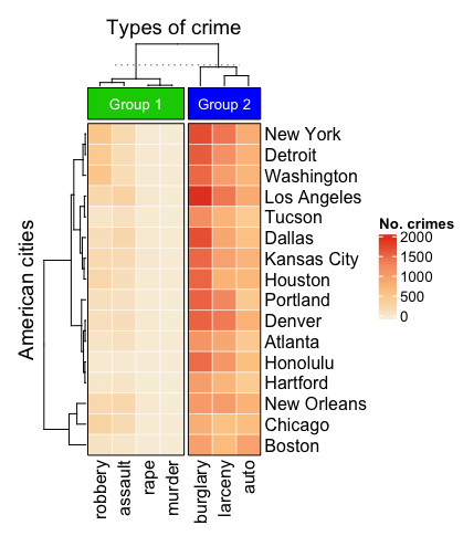
5. Simple annotation
Back to our crime data set. Let's say we've implemented some clustering and want to start annotating our heatmap. Heatmap accepts a lot of different types of annotations. Functions such as top_annotation and right_annotation can be specified either inside or outside of Heatmap depending on your preference. I've specified it outside for now.
# Create annotation for the top
top_annotation <- HeatmapAnnotation(
    groups = anno_block(
      gp = gpar(fill = 3:4),
      labels = c("Group 1", "Group 2"),
      labels_gp = gpar(col = "white", fontsize = 10)
      )
    )

# Create heatmap
set.seed(42)
Heatmap(data,
        name = "No. crimes",
        column_title = "Types of crime",
        row_title = "American cities",
        clustering_distance_rows = "pearson",
        column_km = 2,
        col = heatmap_colours,
        border = TRUE,
        top_annotation = top_annotation,
        rect_gp = gpar(col = "white", lwd = 0.5))
You'll notice that anno_block is the argument for a rectangular block that can be used as a label (see below). gp and gpar define graphical parameters per annotation.
6. A more complex annotation
This is where things start to get groovy. First of all, let's switch our top annotation to a boxplot using anno_box so that we can get a more informative view of data per crime type. Next, we add row annotations with rowAnnotation to Heatmap. rowAnnotation is actually the same thing as HeatmapAnnotation, except it is specifically for use with rows rather than columns. The two annotations we'll add to the side are the total instances of the proportions of crime type per city as barplots using anno_bar. We will alter some of their aesthetic parameters as well in the code below.
# Create annotation for the top
top_annotation <- HeatmapAnnotation(
    `No. crimes committed in 1970` = anno_boxplot(
      data,
      gp = gpar(fill = c(7:1))
      )
)

# Create heatmap
set.seed(42)
heatmap <- Heatmap(data,
        name = "No. crimes",
        column_title = "Types of crime",
        row_title = "American cities",
        clustering_distance_rows = "pearson",
        column_km = 2,
        col = heatmap_colours,
        border = TRUE,
        top_annotation = top_annotation,
        rect_gp = gpar(col = "white", lwd = 0.5)
        ) +
        rowAnnotation(
          "Total no. crimes" = anno_barplot(
            rowSums(data),
            gp = gpar(col = "white", fill = "#FFE200"),
            border = FALSE),
          show_annotation_name = TRUE,
          annotation_name_rot = c(90)
        ) +
        rowAnnotation(
          "Crime proportion" = anno_barplot(
            data / rowSums(data) * 100,
            gp = gpar(col = "white", fill = 7:1),
            height = unit(4, "cm"),
            border = FALSE),
          show_annotation_name = TRUE,
          annotation_name_rot = c(90)
        )

# Use auto_adjust to display the row names
draw(heatmap, auto_adjust = FALSE)
It's important to note that we've saved Heatmap as an object and then pass it through draw. The auto_adjust = FALSE setting within draw makes sure that the row labels (cities in this case) are switched on, otherwise they automatically disappear.
Documentation
This tidbit has only touched on some of the intricacies of this package. You can really go to town with annotating your heatmap - in fact, you can also plot two heatmaps side by side, use smaller heatmaps to annotate your main heatmap, or build huge annotations based on extra data. For a complete reference of how to use ComplexHeatmap (and a lot of cool examples), refer to: https://jokergoo.github.io/ComplexHeatmap-reference/book/